Pixetic

Description
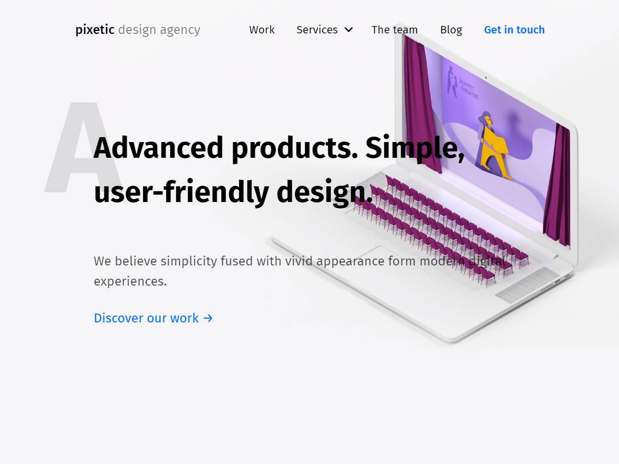
Pixetic believes good ideas deserve quiet, confident design. The new website presents that belief with clarity. Discover, Design, Implement becomes a natural flow, not a slogan. Visitors meet the agency through real product stories, thoughtful interactions and a voice that values usefulness over ornament. The work focuses on websites, web services and mobile apps, and extends into VR, AR, IoT and wearables. Each page shows how a careful UI and responsive UX turn complex requirements into simple decisions. Layouts respect reading rhythm. Typography stays legible on any screen. Motion supports meaning rather than calling attention to itself. The brand narrative is direct. Faith in the idea sits at the center of the process. When a concept is understood and tested, form becomes honest and minimal. That philosophy guides everything from early discovery to handoff. Research notes shape user journeys, interface maps define scope, and component libraries keep quality consistent across platforms. Because teams often arrive with different goals, the site makes collaboration transparent. Prospective clients see process, tools and outcomes from the first scroll. Case studies explain the why behind the how, which builds trust for long projects and fast experiments alike. Search intent informed the architecture from day one. People look for a digital design agency that can ship clean UI, design interactions for complex systems and support a product roadmap beyond launch. The site uses semantic markup, descriptive alt text and structured data for services and case content. Copy includes the terms decision makers actually use when comparing partners, from interaction design for SaaS dashboards to prototyping for mixed reality. Images load in modern formats, scripts are lean and accessibility standards are treated as baseline. The result is quick pages, clear navigation and lower bounce on mobile. What makes Pixetic distinct is the craft behind restraint. Minimal does not mean empty. It means every element has a job. Buttons confirm state with subtle feedback. Forms explain requirements in plain language. Microcopy anticipates questions before support needs to step in. This is design that scales well, because foundations are strong. Teams get a product that feels effortless to use and practical to maintain. Brands get a digital presence that reflects their values and earns attention over time. The site is an invitation to work together with focus, respect for detail and belief in ideas that matter.