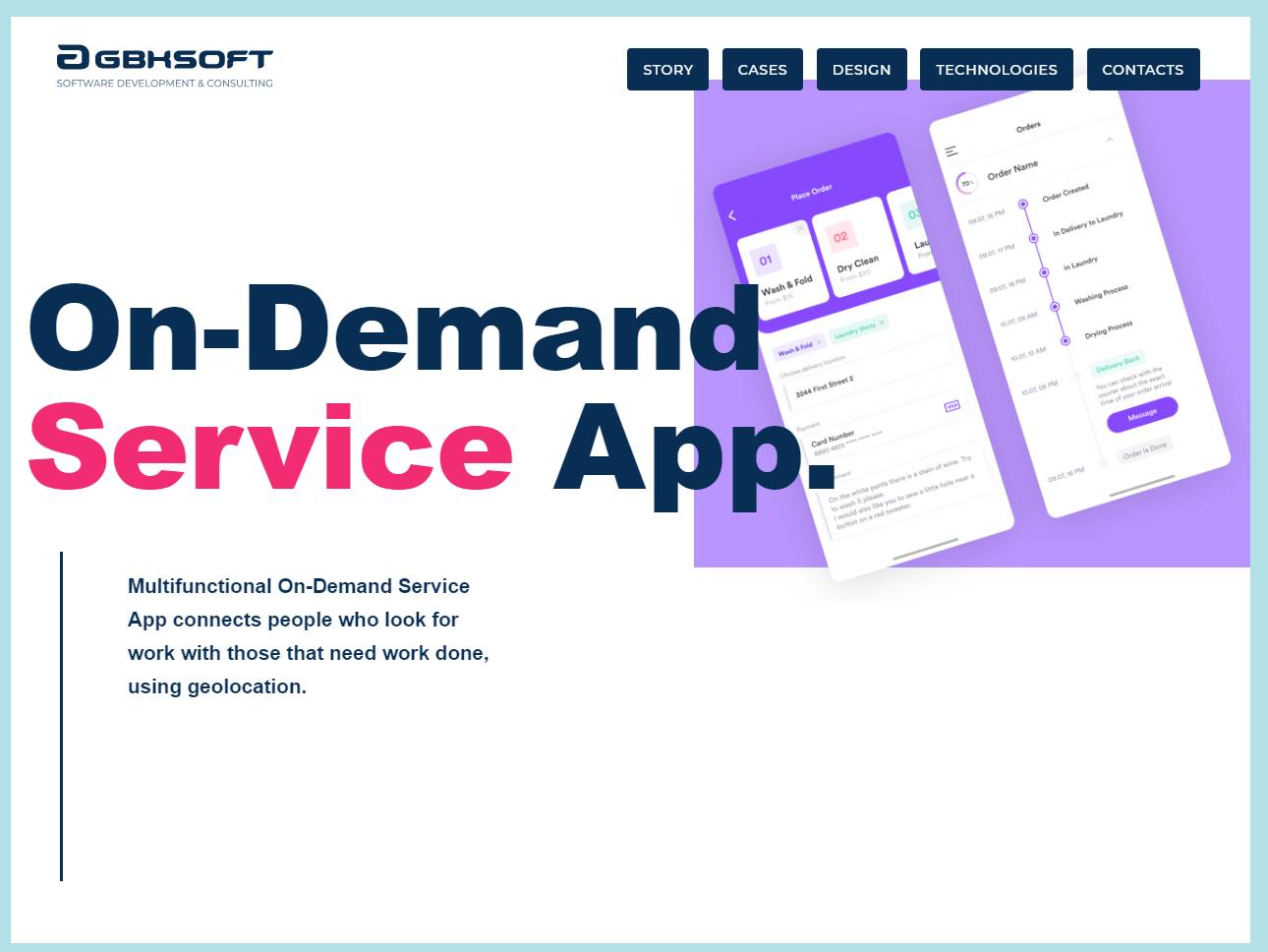
On-Demand Service App

Description
The On Demand Service App turns everyday tasks into a calm, colorful flow. We started with a bright palette that feels friendly at first glance and keeps its energy through long sessions. Trend led illustrations guide the eye, soften complex choices, and add personality without stealing attention from the work. Every screen invites action. Buttons look tappable. Forms ask only what is needed. Micro copy sets clear expectations. You always know what happens next. The interface was built around real moments. Book a cleaner, schedule a repair, order a courier, all feel natural because the paths are short and predictable. Search anticipates intent. Filters remember your last choices. Progress indicators remove doubt during booking and payment. The result is an experience that reduces time to completion and boosts repeat use. It looks playful, yet it behaves like a tool you can trust. Navigation is simple. A grounded home view highlights the next best step, while a persistent bottom bar keeps essentials within thumb reach. Cards summarize services with recognizable visuals and precise summaries. Motion is quiet and purposeful. Subtle transitions confirm actions and help the brain connect cause and effect. Accessibility was part of the first sketch. Color contrast clears audits. Type scales adapt cleanly across phones and tablets. Tap targets are generous. VoiceOver reads elements in a logical order. Nothing ornamental fights legibility. We designed for service providers as carefully as we did for customers. The provider dashboard turns availability, job requests, route planning, and payouts into a single, coherent workflow. Alerts arrive at the right time. Earnings data is readable at a glance. Ratings and feedback are framed to encourage constructive improvement. Trust grows on both sides because the product makes agreements visible and follow through easy. Brand identity ties it all together. The palette holds bright hues that stack well against dark mode. Illustration styles match the tone of the copy, light, optimistic, and precise. Icons echo the geometry of the logo so the system feels cohesive. When you look closely you see small touches that signal care, rounded corners where it helps, crisp dividers where it counts, and delightful empty states that never waste the user’s time. The On Demand Service App proves that utility and charm do not compete. They collaborate to create an experience people return to without thinking twice.