In the realm of design, color isn’t just a visual delight; it’s a symphony of aesthetics and emotions dancing on a canvas. Crafting the right ensemble of colors is akin to composing a memorable tune. As a seasoned design maestro, I’m here to share the secrets of orchestrating the perfect color harmony for your projects. Check out the top 10 pro tips for selecting the best color scheme or palette for designs & how to choose the best combinations with theory inspiration secrets.
1. Dive Deep into Color Theory
The beauty of color theory lies in its vastness. It’s more than just identifying primary, secondary, or tertiary colors; it’s about understanding their relationships and intricacies. By learning how to manipulate tints (adding white), tones (adding gray), and shades (adding black), you can find the perfect balance for your design.
Complementary, analogous, and monochromatic schemes are avenues to guide the eye and maintain visual interest. A well-informed grasp of these principles ensures your design stands out while maintaining harmony and balance. Check out the pro tips for selecting the best color scheme or palette for your designs & how to choose the best combinations with theory inspiration secrets.
2. Reflect Your Brand’s Soul Selecting Color Palette
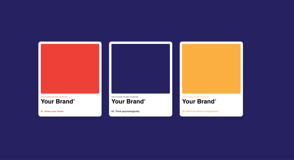
Every brand has a heartbeat, a rhythm that sets it apart. Colors can translate this intangible essence into a tangible visual narrative. The calmness of blues might evoke trust and reliability, while the energy of yellows could encapsulate innovation and freshness.
But to truly echo your brand’s soul, dive into even subtler color variations. Explore the difference between navy and azure or lemon and mustard. These minutiae can fine-tune your brand’s message, ensuring authenticity and distinction. Check out the top 10 pro tips for selecting the best color scheme or palette for your designs & how to choose the best combinations.
3. Nature: The Original Maestro
Our natural world is a canvas of color combinations that inspire and evoke feelings. The muted pastels of an early morning sky or the vibrant shades during fall—nature offers a masterclass in color harmony.
By studying these natural combinations, designers can extract palettes that are inherently pleasing to the eye. Nature’s color schemes also carry innate emotional associations, providing an excellent starting point for brand narratives.
4. The Art of Readability
In today’s digital age, with content being consumed at lightning speed, your designs must communicate quickly and clearly. Colors play a significant role here. It’s not just about picking a background and a text color; it’s about ensuring that the text is effortlessly legible against its backdrop.
Factor in considerations like ambient lighting, device variations, and even potential visual impairments of your audience. These nuances can dramatically influence your design’s effectiveness.
5. Embrace Minimalism by Selecting Color Palette
In a world bombarded with stimuli, simplicity can be a refuge. By constraining your color choices, you can deliver clear, concise messages. A minimal palette ensures that the viewer isn’t overwhelmed and can focus on the core message. It’s also about brand consistency; fewer colors mean clearer brand recall. Remember, minimalism doesn’t mean monotony—it’s about strategic restraint.
6. A Palette Without Borders
In our global village, your designs may be seen across continents. A shade that’s jubilant in one culture could be somber in another. Such cultural nuances in color perception can make or break your design’s universality. Research is paramount. Dive into the color stories of various cultures, ensuring your design communicates the intended message everywhere it’s viewed.
7. Emotion is Everything Selecting Color Palette
Every color has a psychological impact—a story it whispers to our subconscious. Soft blues can be soothing, recalling serene beach scenes, while bold reds might stir up passion or urgency.
By marrying color psychology with your design’s intent, you ensure a richer, more immersive experience for your audience. This alignment can amplify the emotional resonance of your design manifold. Check out the top 10 pro tips for selecting the best theory inspiration secrets for color scheme or palette for your designs & how to choose the best combinations.
8. Test and Iterate
A masterpiece is seldom created in the first stroke; it’s an iterative process. This principle holds in the realm of color selection. Once you’ve chosen your palette, expose it to real-world tests.
Check its appeal in print, on various screens, in different lighting conditions. Gather feedback and refine. So, this iterative refinement ensures a palette that’s theoretically perfect and practically impactful.
9. Digital Tools: Your Virtual Color Assistants
In our tech-driven era, designers have powerful allies in digital tools. Platforms like Adobe Color can do more than suggest palettes; they provide insights grounded in color theory.
These platforms can validate your choices, offering suggestions on harmony, contrast, and more. By incorporating these insights, your design instincts are sharpened and substantiated. Check out the top 10 pro tips for selecting the best color scheme or palette for your designs & how to choose the best combinations.
10. Stay Updated with Trends
Design, like any art form, evolves. What’s en vogue today might be passé tomorrow. However, integrating trending colors should be more than just a nod to fashion. Moreover, it should resonate with your brand’s voice and the message you’re conveying.
Trends offer fresh perspectives and can infuse a contemporary flair into your designs, but they should always be integrated thoughtfully. Check out the top 10 pro tips for selecting the best color scheme or palette for your designs. Moreover, how to choose the best combinations.
Extra Tips for Mastering Your Color Palette Choices:
- Trust Your Instincts Sometimes, even with all the knowledge and tools at your disposal, your gut feeling might be the best judge. Trust your design instincts, honed over time and projects.
- Consider Different Mediums How a color displays on a digital screen can vastly differ from how it prints on paper or appears on fabric. Always adapt and adjust based on the final medium of the design.
- Seek Inspiration Everywhere From art galleries to street graffiti; inspiration can strike anywhere. Stay curious and open-minded. A seemingly unrelated color combination in a vintage poster might spark the perfect idea.
- Engage in Peer Reviews Sometimes, fresh eyes can provide invaluable insights. Finally, collaborative brainstorming and feedback can enhance the depth and versatility of your color choices.
- Historical Context Matters Colors have histories. They’ve been symbolic in various eras and movements. Understanding this can add more depth to your designs, especially if you aim for a retro or historical vibe.
- Stay Environmentally Conscious In today’s eco-conscious world, choosing sustainable materials and inks is not just a trend but a necessity. Remember that the sustainability of your designs, including color choices, matters to a modern audience.
Conclusion
Color is more than just a visual stimulant—it’s a communicator, a mood setter, and often, the first impression of a brand or message. As designers, the responsibility to wield this powerful tool with care and precision cannot be emphasized enough.
By continually learning, adapting, refining, and being open to inspiration from all corners, one can truly master the intricate dance of colors in design. The journey to the perfect palette is as much about science as art, blending in harmony to create designs that resonate, inspire, and leave a lasting impact.