CPD Certification Service

Description
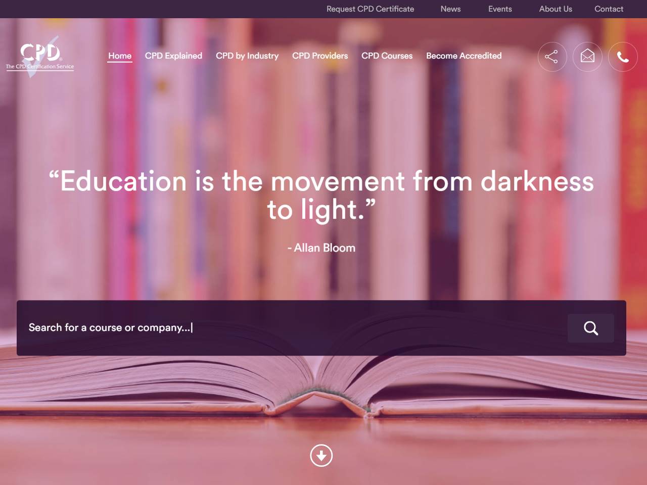
The CPD Certification Service site proves that trust is built through clarity and calm design. From the first screen you can see where to start, whether you are an organisation seeking accreditation, a professional checking a provider, or an employer verifying training quality. Language stays plain. Navigation follows a simple arc, learn what CPD accreditation means, see the criteria, apply with confidence, and track outcomes over time. Forms feel short because fields only appear when needed. Helpful notes sit beside each step, so teams submit the right evidence the first time and avoid back and forth. Every page of CPD Certification Service balances authority with welcome. Typography is readable at any size. Contrast is tuned for long policy PDFs and quick scans on a phone. Calls to action are consistent, which makes the journey predictable and stress free. A compact header keeps search in reach, useful when a visitor wants a provider name, a sector category, or guidance on structured hours. Accreditation pathways are explained with real examples and timelines that reflect how assessments happen in practice. Once an application begins, the dashboard anchors progress, stores documents, and records decisions, which creates an audit ready trail for compliance teams. The resource library carries real weight. Articles answer common questions in professional language, then link to templates and exemplar submissions. Events and webinars sit alongside sector specific highlights, so people can plan development that aligns with their roles. A news area tells the story of continuing professional development across industries and helps editors cite the site as a primary reference. Technical foundations support that mission. Pages load quickly, media is optimised, and schema communicates accreditation, organisation, and event data clearly to search engines. Accessibility is not an afterthought. Focus states are visible. Forms announce errors clearly. Documents use descriptive titles that work well for screen readers. The overall effect is a web experience that reflects the principles of CPD itself. Set high standards. Show your working. Improve through iteration. Professionals arrive, find answers without drama, and leave with the next action already in hand. Organisations get a straightforward way to earn and maintain accreditation. Employers see the signal they need to support staff development with confidence. Simple, usable, and elegant becomes more than a tagline. It becomes the way the service delivers value every day.