Chronofund

Description
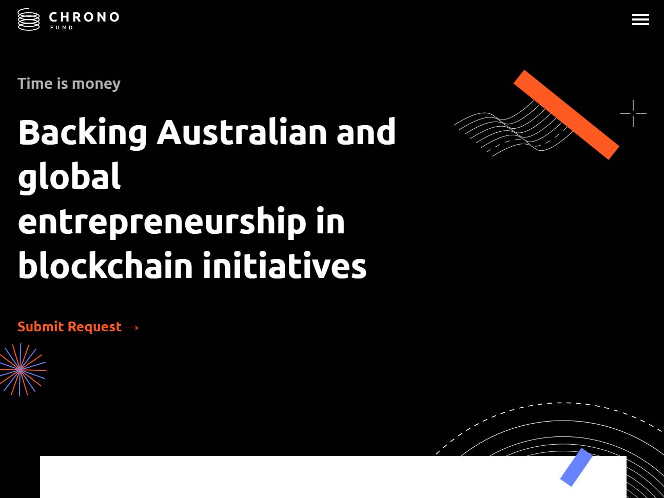
Chronofund presents a venture fund website that treats capital as creative momentum. The visual language leans into abstractionism, bold shapes and layered textures that feel adventurous, yet disciplined enough for serious decisions. Color blocks shift like market cycles, gradients hint at velocity, and geometric forms suggest the way ideas compound when founders and investors move in sync. The effect is distinct and memorable, a brand presence that attracts attention for the right reasons and stays recognizable in a sea of sameness. The interface is quick and confident. Navigation flows in short, purposeful steps, so an LP can scan a thesis, review sectors, and request a deck in one visit. Typography blends editorial clarity with gallery level polish. Key figures, fund stages, and portfolio highlights appear in scannable modules that never bury context. Animations earn their place. Micro motion reveals relationships between data points, explains strategies, and guides the eye without clutter. Accessibility holds steady from the first component, strong contrast, logical focus order, generous targets, reliable performance on mobile and desktop. Abstraction is not decoration here, it is storytelling. Compositions echo the way early bets become portfolios, the way patterns emerge from noise, the way timing turns conviction into returns. Case sections read like compact studies. Each shows what the team saw, how the decision was made, and what changed because of it. A founder friendly area explains what to expect, diligence steps, timelines, intros, post investment support, all in plain language. A press and insights hub turns thought leadership into a helpful archive rather than a megaphone. Schema, fast pages, and clean markup help search engines understand the site and bring the right readers to the right pages. Editors can reshape the site in minutes. Components were built for speed, so new theses, partners, events, and portfolio updates slot in cleanly. Analytics tie calls to action to content blocks, so the team knows what resonates and can iterate without guessing. Security and privacy are respected throughout, from gated files to contact flows that reduce noise for the investment team. Chronofund ends up feeling like a gallery and a data room at once, expressive identity paired with precise information. It invites founders who think big and LPs who value craft, then gives both a clear path to start a conversation.