b2basket

Description
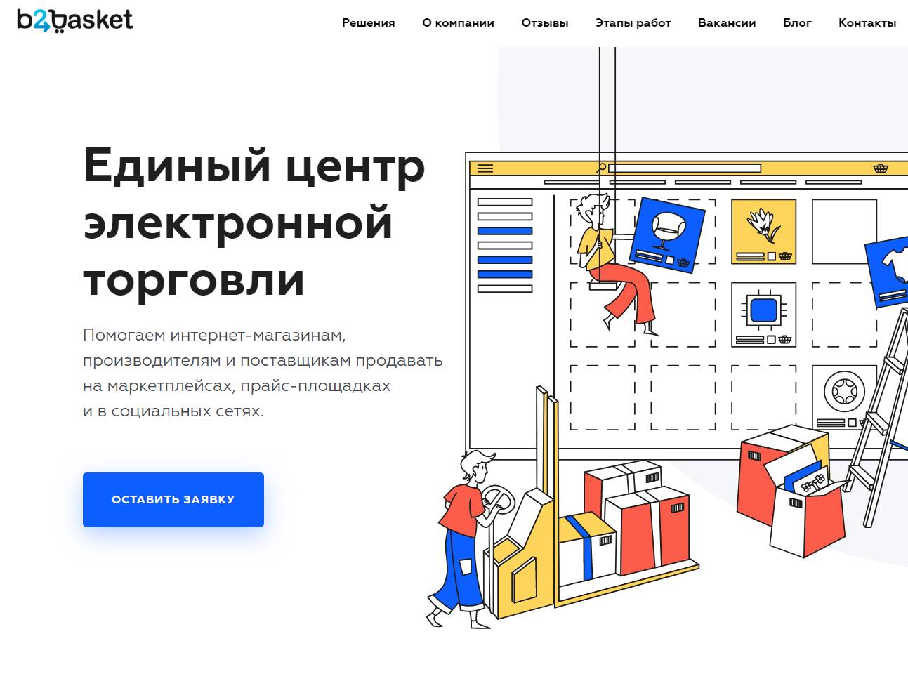
b2basket is a colorful website for an IT startup that treats clarity like a feature. The palette is bright without feeling noisy, and the custom illustrations pull double duty. They signal the brand’s personality and guide attention toward the next step. Each scene was drawn to explain a concept in seconds. A character points to a key metric. A playful diagram reveals how the product connects. The result feels fresh and human, yet it works like a tool that respects your time. The page opens with a sharp promise and a hero visual that lands the message fast. Copy stays specific. It says who the product is for, what it fixes today, and how outcomes show up in real workflows. Screens are honest. They show live states rather than mockups, so a buyer can picture how the product behaves under real pressure. Navigation is light and obvious. A short path links problem, solution, proof, and invitation. Forms are respectful. Autofill works, error states are clear, and confirmations are immediate. Performance backs the design. Images are compressed and responsive. Code is tidy and semantic. Search engines understand the topic, the structured data, and the relationships between sections. That foundation pairs with thoughtful content so the site ranks for intent driven queries rather than generic buzzwords. Accessibility was part of the first sketch. Contrast is strong, type scales cleanly across devices, and tab order follows the story in a way that screen readers can parse without friction. The illustration system is built to scale. New features can get a scene in the same style, which keeps the brand consistent as the roadmap evolves. Micro interactions add a layer of confidence. Buttons respond with gentle feedback. Cards reveal detail on hover or tap. Motion is quiet and purposeful, designed to show cause and effect rather than steal the spotlight. Social proof and customer quotes appear in context, close to the decision they support, which keeps attention where it matters. For the team behind the site, editing is simple. Components are modular, so a new headline, a comparison block, or a case study slides into place quickly. Analytics connect each call to action to its upstream content, which makes iteration straightforward after launch. The result is a site that looks alive, reads clean, and converts on purpose. b2basket proves that a colorful, illustrative approach can sell serious software, as long as the craft serves the message and the message serves the user.