A 2026 SaaS homepage is no longer judged only at 1440 pixels wide. It now has to survive as a 1200 x 630 Open Graph card, a 1080 x 1350 feed image, a 1080 x 1920 story, a 1920 x 1080 video thumbnail, a cropped product screenshot in a newsletter, and a half-visible preview on mobile search. Design is still about beauty and hierarchy. But now it is also about extractability. In this article, we’ll explore the new SaaS (Software as a Service) homepage brief, design for screenshots, social crops, and distribution.
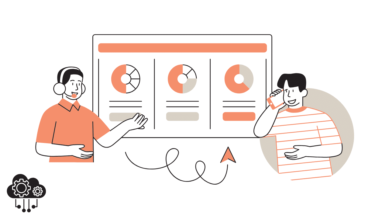
That is why product-led brands such as Crowbert are useful references. If the site also supports an ongoing content engine, as shown in Crowbert’s AI content, scheduling, and analytics feature stack, every hero, dashboard mockup, proof block, and benefit section has to work both as a conversion page and as a reusable content source.
The best gallery-worthy SaaS sites in 2026 do not just “look clean.” They are built like modular source files for distribution.
1. Design the Hero for 6 Canvases, Not 1 – New SaaS Homepage Brief
Before you obsess over a desktop hero, test whether it can be cropped into at least 6 common outputs:
- 1200 x 630 for link previews
- 1080 x 1080 for square social posts
- 1080 x 1350 for portrait social posts
- 1080 x 1920 for story or reel covers
- 1920 x 1080 for video thumbnails
- 390 x 844 for modern mobile screens
If the headline only works when every decorative element is visible, the system is fragile. A strong hero still communicates when 30% to 40% of the original composition is gone.
2. Use Modular Bands That Can Be Screen-Captured Cleanly
Think in reusable bands, not one long painted canvas. Each homepage section should be able to stand alone as a screenshot. A useful test is the “3-crop rule”: can the section still make sense as a full-width crop, a left-half crop, and a mobile crop? If not, the visual hierarchy probably depends on too much surrounding context.
For most SaaS teams, a homepage built from 7 to 9 clean modules is more reusable than one built from 20 highly interdependent micro-sections.
3. Give Product Mockups 3 States New SaaS Homepage Brief
One frozen dashboard image is not enough. Build product visuals in 3 states:
- Full UI for homepage credibility
- Zoomed feature crop for social reuse
- Annotation-ready version for education posts
This is especially important for software screenshots. The same product frame should be able to support a hero image, a carousel slide, and a before-versus-after explainer without needing a complete redesign every time.
4. Write Headlines That Survive Without Supporting Copy
Gallery sites often celebrate typography, spacing, and motion, and rightly so. But from a distribution perspective, the headline is still doing the heaviest lifting. Aim for 8 to 14 words in hero headlines and 5 to 10 words in section headers. Short enough to survive cropping. Specific enough to communicate without the paragraph beneath it.
If a heading becomes vague when the supporting paragraph disappears, it is not ready for social distribution.
5. Build Safe Zones for Motion and Decorative Layers New SaaS Homepage Brief
Decorative gradients, pointer cues, floating cards, and glows often break first when the page is repurposed. Treat them as optional flourishes, not information carriers. Keep critical copy and product proof inside a central safe zone that occupies roughly the middle 60% to 70% of the frame. That way, social crops and mobile previews preserve the message even when edge content is lost.
6. Turn Social Proof into Reusable Evidence Blocks
The strongest homepage proof sections now ship with numbers, not just adjectives. Think in stacks like this:
- 1 headline claim
- 3 proof points
- 1 customer quote
- 1 visual artifact such as a chart, badge, or stat card
This structure makes it easy to pull a testimonial graphic, a stat post, or a founder commentary slide from the same source section. One well-built proof band can produce 4 or 5 downstream assets.
7. Design a Distribution Kit Before Launch
Most teams finish the site first and think about repurposing later. Flip that. Before the homepage goes live, prepare a distribution kit with at least:
- 5 ready-to-crop screenshots
- 3 short product loops under 10 seconds
- 2 founder quote cards
- 1 square hero version
- 1 portrait hero version
- 1 Open Graph image set
This takes discipline upfront, but it removes 10 to 20 micro-decisions every time the team needs to publish.
A Scoring Rubric for Distribution-Ready Design
Here is a simple 10-point rubric for evaluating a SaaS homepage:
- 2 points: headline clarity when cropped
- 2 points: screenshot reusability
- 2 points: proof density
- 2 points: mobile legibility
- 2 points: ability to turn the page into social assets without redesign
If the page scores 8 or higher, it is probably built for both conversion and distribution. If it scores 5 or lower, it may still be beautiful, but the content team will keep rebuilding assets from scratch.
Why This Matters More in 2026
Design teams are no longer handing off a finished page to marketing and walking away. The page is now an active content source. Every launch, update, benchmark, pricing note, or product workflow becomes a potential post, screenshot, reel, or carousel. The best SaaS sites understand this and design accordingly.
Final Takeaway
The new homepage brief is simple: create something that wins in the browser and downstream. If your hero can only exist as a homepage hero, the design system is incomplete. If your page can generate 10 to 20 clean social assets without a redesign, you are not just designing a website. You are designing a distribution engine.