How to Choose Colorful Wall Art for Every Room
Bold paintings fail when they’re too small or their colors have nowhere to land. Match palette, size and light to each room with this guide.
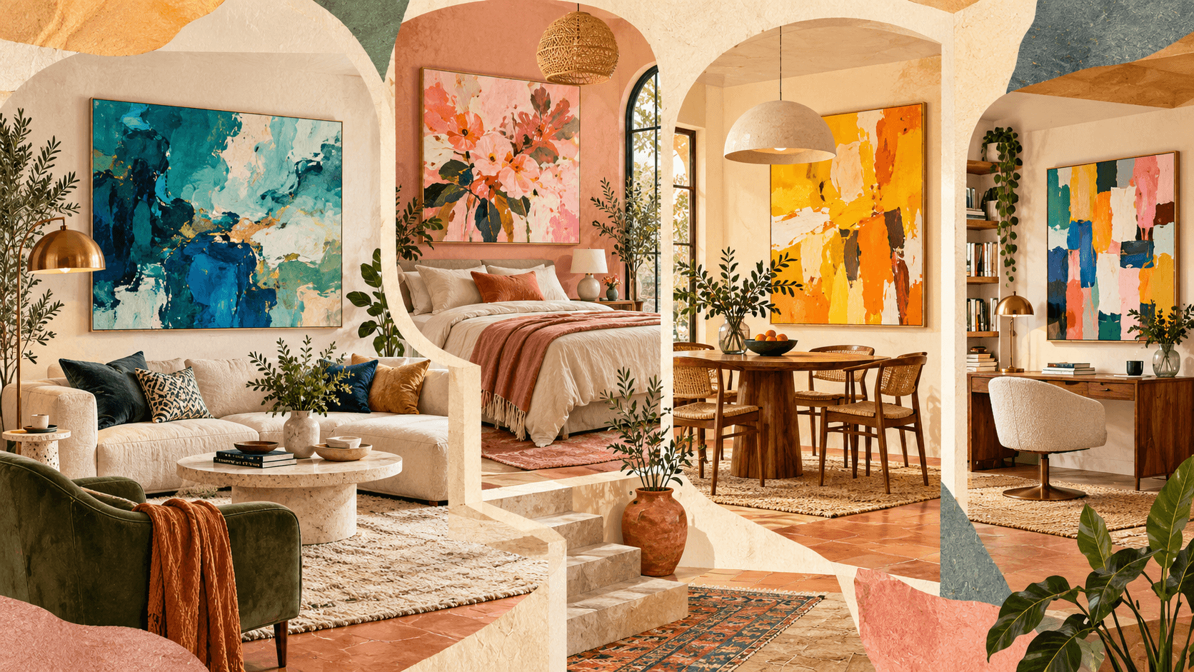
Colorful wall art rarely fails because of the colors themselves. It fails because the painting is too small for the wall, because none of its colors show up anywhere else in the room, or because the evening light turns its blues muddy. Fix those three things and almost any palette can work, from a quiet blue-green abstract to a loud yellow and black statement piece.
Choosing colorful wall art comes down to four decisions: what the painting needs to do, which colors connect it to the room, how big it should be, and how it will be lit. This guide walks through each one with real numbers in inches and centimeters, pairing tables for wall and sofa colors, and one room worked through from start to finish. It ends with what to check before buying colorful paintings online, where a wrong size or a color that looked different on screen is the most expensive mistake to fix.
The sizing ranges follow the two-thirds convention galleries and installers commonly use, the color pairings rely on standard color-wheel relationships, and the product examples were checked against their live listings when this guide was last updated.
Table of contents
- Quick Answer: How to Choose Colorful Wall Art
- Decide What the Painting Has to Do
- Colorful Painting Styles and Where They Work Best
- How to Build a Color Palette Around Your Painting
- What Color Art Goes With Your Walls?
- What Colorful Art Goes With Your Sofa?
- Colorful Wall Art Ideas for Every Room
- How Big Should Colorful Wall Art Be?
- One Large Painting or a Multi-Panel Set?
- Building a Colorful Gallery Wall
- Canvas, Framed or Rolled: Finishing Bold Color
- Lighting Colorful Paintings So the Colors Read True
- Example: Choosing Colorful Art for One Living Room, Step by Step
- How to Shop for Colorful Paintings Online
- Common Mistakes With Colorful Wall Art
- Start With One Wall
- Colorful Wall Art Questions: Sizing, Wall and Sofa Colors, Lighting and Buying Online
Quick Answer: How to Choose Colorful Wall Art
- Give the painting one job: a focal point, a bridge between colors you already own, or a quiet mood setter.
- Find a bridge color: at least one color in the painting should already exist in the room at a meaningful scale, such as a rug, sofa or curtains.
- Size it at 60 to 75 percent of the furniture below. Bold, saturated art can sit at the lower end because it carries more visual weight.
- Hang it low enough to connect: 6 to 10 inches (15 to 25 cm) above a sofa or headboard, or centered 57 to 60 inches (145 to 152 cm) from the floor on a bare wall.
- Match the wall’s undertone: warm beige suits terracotta, coral and olive, while cool gray suits cobalt, emerald and fuchsia.
- Contrast with the sofa: the painting should share at most one color with the upholstery, so the two read as a pair rather than one block.
- Light it properly: bulbs rated CRI 90 or higher, between 2700K and 3500K, and no direct sun on the canvas.
Decide What the Painting Has to Do
Before you look at a single painting, decide which of three jobs it has. Each one points to a different palette and a different size.
A focal point
The art is the first thing you see when you walk in, and it is allowed to be the boldest object in the room. Saturated color, strong contrast and a large format all make sense here. This is the classic role above a sofa, a bed or a fireplace, and it is where statement wall art belongs.
A bridge
Some rooms already have color scattered around them: a rust rug, olive cushions, a navy armchair, and nothing tying them together. Here the painting’s job is to gather those colors in one place so they suddenly look planned. Look for multicolor compositions that include at least two of the shades you already own.
A mood setter
In a bedroom or a reading corner you want color without a jolt. Softer saturation, more negative space and dusty or cool hues do the work. The painting still adds color; it just doesn’t demand attention every time you walk past.
How much color a room can carry also depends on its overall style. A pared-back room usually takes one strong piece and nothing else on that wall, while a layered room can hold several vibrant pieces at once. If you’re not sure which way your home leans, this comparison of maximalism versus minimalism is a quick way to find out before you buy.
Colorful Painting Styles and Where They Work Best
- Abstract paintings: color, shape and brushwork with no literal subject. Colorful abstract wall art is the most flexible choice for modern living rooms and offices, and the easiest to match to a room because nothing in it has to look realistic.
- Floral paintings: organic shapes and natural pairings such as pink with green or coral with turquoise. They suit bedrooms, dining rooms and entryways. Loose, watery florals feel softer than thick, textured ones, and this look at how watercolor florals are layered shows why soft edges and transparent washes change the effect so much.
- Ocean and landscape paintings: blues, greens and earth tones that add a sense of distance, which helps in small or urban rooms without much of a view.
- Figurative and portrait abstracts: faces or figures in bold, unrealistic color. They carry a lot of energy, so give them a wall where they don’t compete with a TV or busy shelving.
- Geometric and multicolor pieces: blocks and lines in several colors. These make ideal bridge paintings because they can hold four or five room colors at once.
How to Build a Color Palette Around Your Painting
The most reliable method is simple: find one bridge color, and let everything else in the painting act as an accent.
Find the bridge color
Pick one color in the painting that already appears in the room at a meaningful scale, in a rug, a sofa, curtains or a large plant. That shared color is what makes the art look like it belongs. The painting’s other colors can then be completely new, because the bridge has already done the work of connecting it to the room.
Use the 60-30-10 rule loosely
The 60-30-10 rule splits a room into roughly 60 percent dominant color (usually walls and large furniture), 30 percent secondary color and 10 percent accent. Colorful wall art usually supplies the 10 percent, and sometimes part of the 30. Warm white walls, oatmeal linen upholstery and coral pulled from a painting into two cushions is the rule in action. Treat the numbers as a sanity check rather than a formula.
Match undertones, not just colors
Two beiges can look identical on a paint chip and completely different next to the same painting. Warm beige leans yellow or pink; cool beige and greige lean gray or green. Compare the painting’s main colors with your wall in daylight and again at night under your usual lamps, and if you’re buying online, ask the seller for photos taken in natural light. If the painting’s whites look dirty or its blues turn greenish, the undertones are fighting.
Repeat colors sparingly
Echo one or two colors from the painting elsewhere in the room: a throw, a vase, a stack of books. Two or three small echoes are enough. Matching every cushion to the painting makes the room look like a showroom set rather than a home.
Blue and green
Easy to live with and hard to get wrong. Blue-green art works with white walls, cream upholstery, light oak and linen, and suits living rooms, bedrooms and home offices. Watch the lighting, though: very warm bulbs can push blues toward a flat gray-green.
Pink, coral and soft green
Warm and fresh at the same time, because coral and green sit roughly opposite each other on the color wheel. This palette suits floral-leaning rooms, guest bedrooms and spaces with rattan, cane or pale wood.
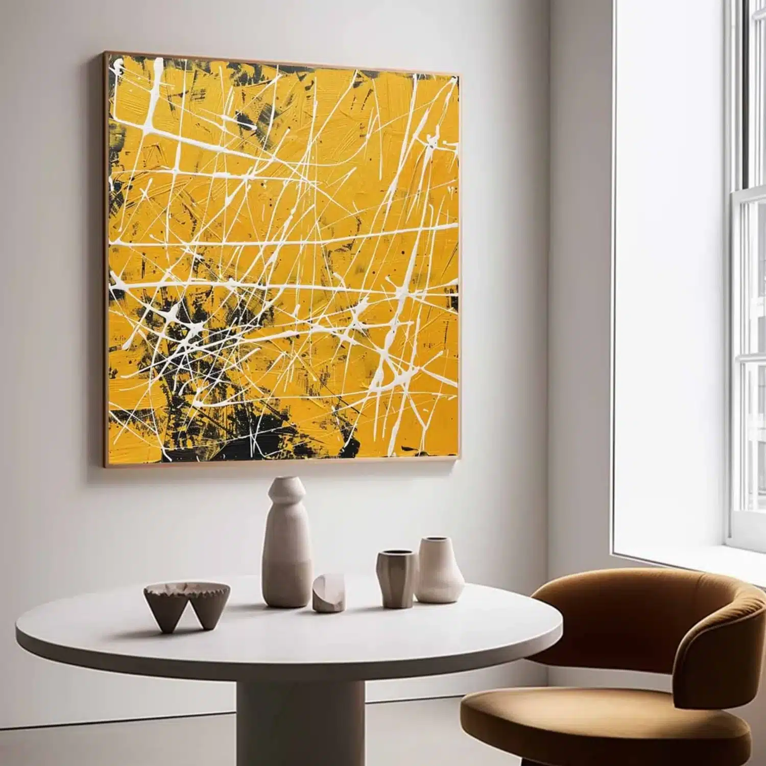
Yellow, orange and black
The highest-energy palette here, and the brightest wall art you’re likely to hang. Against white, gray or charcoal walls it reads as a deliberate statement. Black detailing gives the yellows structure so they don’t look sugary.
Multicolor compositions
The best choice when a room already has several colors that don’t quite talk to each other. Identify the two or three dominant colors in the painting and make sure at least one of them is already in the room. The rest can be new.
What Color Art Goes With Your Walls?
Wall color is the backdrop every painting has to work against. Most of the pairings below come from complementary colors, the ones that sit opposite each other on the color wheel: blue against orange-toned beige or wood, pink against sage. That contrast makes both colors look more saturated, which is why a fairly modest teal painting can look striking on a warm beige wall.
| Wall color | Colorful art that works | Why it works |
|---|---|---|
| Bright white | Almost anything; saturated primaries and multicolor abstracts read strongest | A neutral ground gives maximum contrast |
| Warm white or cream | Coral, terracotta, ochre, olive, warm pinks | The art shares the wall’s warm undertone |
| Warm beige or greige | Terracotta, rust, olive, mustard, with teal or navy as contrast | Earthy hues echo the undertone; blue sits opposite orange-leaning beige on the color wheel |
| Cool gray | Cobalt, emerald, fuchsia, lemon yellow | Clean, cool-leaning hues match gray’s blue undertone |
| Sage or olive green | Blush, coral, rust, plum | The red and pink family complements green |
| Navy or charcoal | Gold, ochre, coral, light-ground abstracts | Light, warm colors glow against a dark wall |
| Warm wood paneling | Blues, teals, deep greens | Blue sits opposite orange-brown wood |
Art for white walls
White is the most forgiving backdrop, and saturated primaries and multicolor abstracts look their strongest against it. The catch is scale: on a stark white wall a small painting looks even smaller, so stay at the upper end of the size range. Warm whites flatter coral and ochre, while crisp blue-whites flatter cobalt and emerald.
Art for beige and greige walls
Find the undertone first by holding a sheet of plain white printer paper flat against the wall. Next to pure white, warm beige looks yellow or pink, and greige looks gray or slightly green. Warm beige suits terracotta, rust, olive and mustard, with teal or navy as the contrast accent. Greige pairs better with dusty blue, sage, plum and soft coral.
Art for gray walls
Most grays lean blue or green. Cool grays suit cobalt, emerald, fuchsia and lemon yellow, while warmer grays work with coral, ochre and teal. Avoid mid-tone, muted art on a mid-gray wall: with so little contrast, both end up looking dull. Pick a piece that is clearly brighter or clearly deeper than the wall.
Art for green walls
Sage, olive and deeper greens pair best with their complement, the pink and red family: blush, coral, rust and plum. Leafy botanical art tends to disappear on a green wall, so if you love florals, choose ones with strong pinks or a light background.
Art for navy, charcoal and other dark walls
Dark walls make color glow. Light-ground abstracts, gold, ochre and coral stand out beautifully, and even a modest painting reads as a focal point. Lighting matters more here than anywhere else, because dark paint absorbs light; plan a picture light or an angled spot from the start.
What Colorful Art Goes With Your Sofa?
The sofa is usually the largest block of color directly below the art, so it matters almost as much as the wall. The rule underneath every row here: let the painting share at most one color with the upholstery, so the two read as a pair rather than one block.
| Sofa color | Colorful art that works | Watch out for |
|---|---|---|
| Gray | Mustard, coral, teal, cobalt; almost any saturated color | Mostly gray or silver art that blends into the sofa |
| Navy or blue | Rust, ochre, coral, blush, gold accents | Blue-dominant art that turns the wall and sofa into one blue block |
| Green or emerald velvet | Pink, coral, rust, gold | Green-heavy art that competes with the upholstery |
| Cognac or brown leather | Teal, blue, green, olive, cream-ground abstracts | Orange-brown art that makes the room feel monotone |
| Cream, white or beige | Almost anything; the easiest sofa for bold art | Very pale art that disappears against both sofa and wall |
| Black or charcoal | Bright primaries, yellow, coral, white-ground abstracts | Dark, moody art that merges with the sofa |
Colorful Wall Art Ideas for Every Room
Each room asks something different of a painting. Here’s how colorful wall art for the living room, bedroom, dining room and smaller spaces differs, starting with a quick reference.
| Room | What the art should do | Palettes that work | Starting format |
|---|---|---|---|
| Living room | Anchor the seating area | Blue-green abstracts, coral and teal, warm multicolor | One horizontal piece at 60 to 75 percent of the sofa width |
| Bedroom | Add color without overstimulating | Blush, sage, dusty blue, muted terracotta | Horizontal above the headboard, or two verticals |
| Dining room | Spark conversation | Yellow, orange, red, high-contrast abstracts | Horizontal above the sideboard, hung slightly lower |
| Home office | Personalize the space and frame video calls | Blues and greens with one warm accent | Medium piece visible from the desk and the camera |
| Entryway or hallway | Set the tone and guide movement | One color repeated from the main living area | Vertical on narrow walls; a series in long halls |
| Kids’ room or nursery | Energize play areas, calm sleep areas | Bright primaries for play, soft pastels near the bed | Lightweight canvas; nothing heavy above a crib |
| Kitchen or bathroom | Add a small dose of color safely | Citrus, herbal greens, sea blues | Small framed print behind glazing, away from steam |
Living room
The living room can usually take the boldest piece in the house. A single horizontal painting above the sofa is the default for good reason: it anchors the seating area and gives the room a center. Blue-green abstracts sit comfortably with neutral sofas, while warm multicolor florals or coral and teal compositions add more personality.
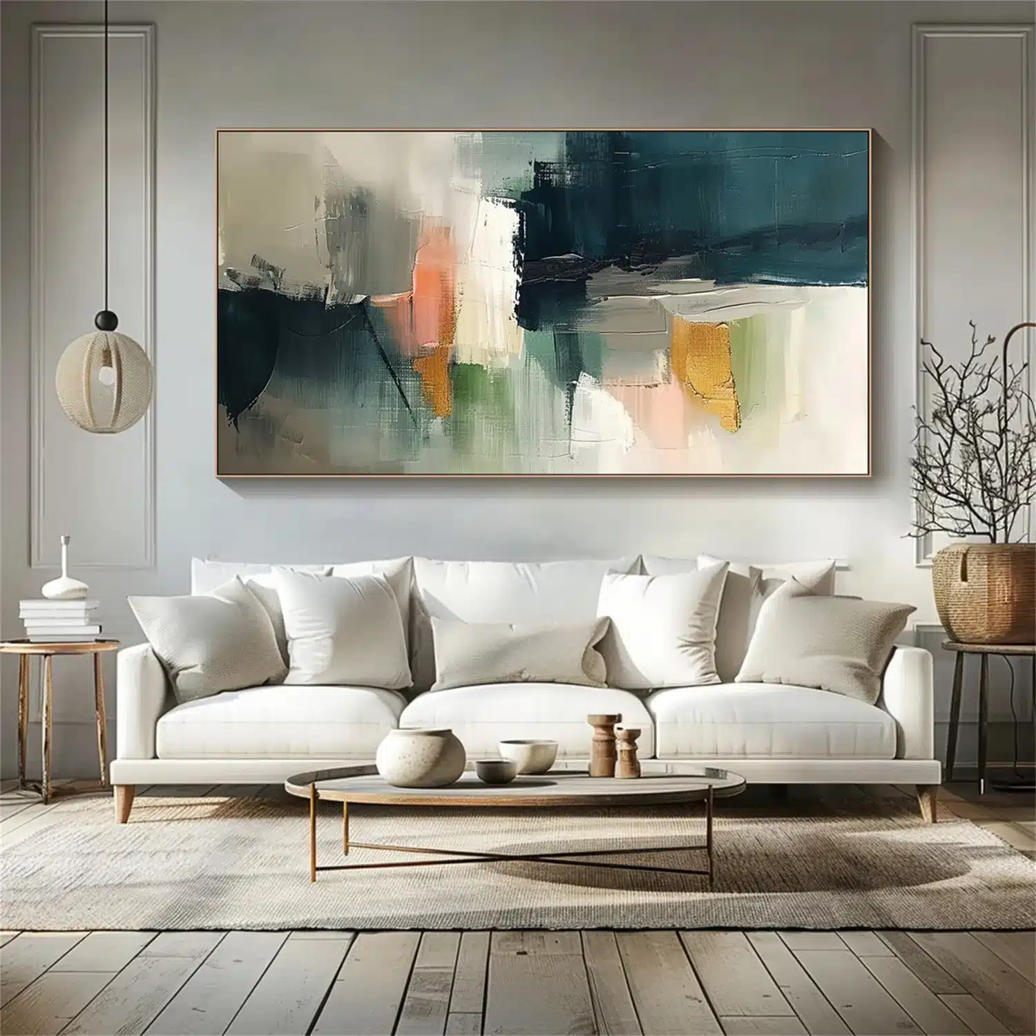
For long walls or sectional sofas, a larger canvas or a coordinated two or three panel set keeps the art in scale with the furniture. Measure the wall before you fall for a specific size.
Bedroom
Colorful art for a bedroom should add warmth without keeping you awake. Dusty pink, sage, blue-gray, muted terracotta and cream all introduce color quietly. Hang the piece above the headboard and size it against the bed’s width, not the wall’s. Two matching verticals on either side of the bed work well when a window or wall lights get in the way of a single piece.
Dining room
Dining rooms suit warmer, livelier color. Yellows, oranges, reds and expressive abstracts feel sociable, and the room is used in shorter, more animated stretches. Because people look at the art while seated, drop the center a few inches lower than you would in a hallway, and keep it clear of wall lights and shelving.
Home office
Color here does two jobs: it makes a workspace feel like yours, and it frames you on video calls. Sit at the desk, turn on the camera and check what’s actually behind you before you hang anything. A medium-sized abstract in blues or greens with one warm accent tends to read well on camera without pulling attention from your face.
Entryway and hallway
Entryways set the tone for the rest of the home, so repeat one color from the main living area here. Vertical paintings suit narrow walls, and a compact horizontal piece works above a console table. In a long hallway, a series of same-sized pieces that share one color creates rhythm as you walk through.
Kids’ rooms and nurseries
Children’s rooms can take the brightest palettes in the house, especially around play areas. Keep softer colors near the bed so the room can still wind down at night. In a nursery, keep heavy frames and anything with glass off the wall above the crib and changing table; a lightweight canvas fixed securely, or art on a wall away from the crib, is the safer choice. Abstracts and animal subjects also age better than themed nursery art, so the piece can stay as the child grows.
Kitchens and bathrooms
Both can take color, but hand-painted canvas is a poor fit for steam and cooking grease. Humidity swings make canvas slacken and tighten and can encourage mold behind the stretcher bars, so keep original paintings away from showers and stovetops. A small framed print behind glazing is the safer way to add color in these rooms.
How Big Should Colorful Wall Art Be?
Most rooms handle bigger art than people expect, and an undersized painting is the most common reason a colorful piece looks slightly off. If you’re wondering what size art goes above a sofa, a bed or a sideboard, start with these numbers.
Width: 60 to 75 percent of the furniture below
A painting, or a set measured edge to edge including the gaps, should span roughly 60 to 75 percent of the furniture beneath it. That’s close to the two-thirds rule galleries use.
| Furniture | Typical width | Suggested artwork width |
|---|---|---|
| Small sofa or loveseat | 72 in (183 cm) | 43 to 54 in (109 to 137 cm) |
| Standard sofa | 84 in (213 cm) | 50 to 63 in (127 to 160 cm) |
| Large sofa | 90 in (229 cm) | 54 to 68 in (137 to 173 cm) |
| Queen bed (mattress width) | 60 in (152 cm) | 36 to 45 in (91 to 114 cm) |
| King bed (mattress width) | 76 in (193 cm) | 46 to 57 in (117 to 145 cm) |
| Sideboard or console | 60 in (152 cm) | 36 to 45 in (91 to 114 cm) |
Adjust for visual weight
Color changes how big a painting feels. Saturated, warm and high-contrast art reads heavier and seems to step forward, so bold wall art can sit at the lower end of the range. A pale, low-contrast or mostly cool painting recedes, so it usually needs the upper end to hold the wall.
Height: mind the gap, then the ceiling
Above furniture, leave 6 to 10 inches (15 to 25 cm) between the top of the sofa, headboard or sideboard and the bottom of the art. On a bare wall, center the piece about 57 to 60 inches (145 to 152 cm) from the floor, roughly average eye level.
Then check the ceiling. Most sofa backs sit around 30 to 36 inches high, so a 47-inch-tall canvas hung 8 inches above a 34-inch sofa back tops out near 89 inches. Under a standard 8-foot (about 2.4 m) ceiling, that leaves only about 7 inches of breathing room, which is why tall formats often look cramped in average rooms.
Before ordering, mark the outline on the wall with painter’s tape and look at it from the doorway and from your usual seat. If the tape looks timid, size up. For exact canvas sizes by sofa, bed and dining wall, this canvas print size and hanging guide has a full reference table, including the print specs that decide whether a canvas looks considered or cheap.
One Large Painting or a Multi-Panel Set?
A single large painting gives one clear focal point and suits most sofas, beds and sideboards. It’s also the easier choice for strong color, since one bold piece reads as intentional where several can start to compete.
Two or three panel sets spread color across a wider wall and work well with long sectionals or low media units. Keep the gaps between panels at 2 to 3 inches (5 to 8 cm) and count them in the total width. Three 24-inch panels with two 3-inch gaps measure 78 inches, not 72, a difference that can tip a set from generous to oversized.
Choose a single piece when you want simplicity, and a set when the wall is wide or you want a more structured, gallery-like arrangement.
Building a Colorful Gallery Wall
Several colorful pieces on one wall can look curated or chaotic, and the difference is almost always color control rather than the individual artworks.
- Limit the palette: choose three or four colors for the whole wall and make sure every piece carries at least one of them.
- Spread the strongest color: place it in a rough triangle across the arrangement so the eye moves around the wall instead of stopping in one corner.
- Add resting points: about one quiet, mostly neutral piece for every two or three colorful ones gives the eye somewhere to pause.
- Keep one constant: the same frame finish, the same mat color or the same 2 to 3 inch (5 to 8 cm) spacing ties mixed pieces together.
- Size the group as one shape: the whole arrangement should span 60 to 75 percent of the furniture below and be centered the way a single piece would be.
Lay the arrangement out on the floor first and photograph it. A photo shows a color imbalance much faster than standing over the pieces does.
Canvas, Framed or Rolled: Finishing Bold Color
How a painting is finished affects how its colors read on the wall, not just how it hangs. Here’s how the three common options for colorful canvas wall art compare.
| Option | Look | Best for | With bold color |
|---|---|---|---|
| Frameless gallery-wrapped canvas | Clean and contemporary | Modern and minimalist rooms | Lets saturated color run to the edge for maximum impact |
| Framed canvas | Defined edges and a finished border | Contemporary or traditional rooms | A frame contains the color, which calms a busy composition |
| Rolled canvas | Unstretched and flexible | Buyers planning to use a local framer | Lets you choose a frame in person against the actual colors |
Frame color changes how the painting’s colors read. Black sharpens contrast and picks up dark details. White lets the art float on a white wall. Natural wood warms cool palettes and suits Scandinavian and Japandi rooms. Gold flatters warm palettes like coral, ochre and red, while silver sits better with cool blues and grays.
Surface matters too. Thick, textured paint catches light from the side and casts tiny shadows, so the same colors look richer in raking afternoon light than in a flat product photo. This piece on how hand-painted texture changes the way color reads in a room goes deeper into that difference.
Whatever you choose, confirm the finish, materials, outer dimensions and hanging hardware on the individual product page, since options vary from painting to painting.
Lighting Colorful Paintings So the Colors Read True
Light changes color more than any other factor in a room. The same painting can look vivid at noon and flat at nine in the evening.
- Color temperature: warm white bulbs (2700K to 3000K) flatter reds, oranges and yellows. If a painting is mostly blues and greens, a neutral white around 3500K keeps them from drifting gray.
- Color rendering: look for bulbs rated CRI 90 or higher. Low-CRI LEDs can make saturated colors look dull or slightly off, which defeats the point of colorful art.
- Angle: a picture light or track spot aimed at roughly 30 degrees to the wall avoids glare on glossy paint and the hard shadow a frame casts when lit from directly above.
- Sunlight: direct sun is the fastest way to fade a painting, and some reds and pinks are among the most light-sensitive pigments.
Fading isn’t only a direct-sun problem. The Canadian Conservation Institute’s guide to light damage explains that exposure is measured as brightness multiplied by hours, so a moderately bright wall lit all day adds up over the years. For a painting you plan to keep, choose a wall that never catches direct sun, and switch picture lights off when nobody is in the room.
Example: Choosing Colorful Art for One Living Room, Step by Step
Here’s how the steps above work together in a typical room. The room has an 84-inch oatmeal linen sofa, warm beige walls, an oak floor, a rust and cream rug, and a standard 8-foot ceiling. The sofa wall gets no direct sun.
- Job: focal point, because the sofa wall is the first thing you see from the door.
- Bridge color: rust, taken from the rug.
- Wall pairing: warm beige points to terracotta, rust and olive, with teal as the contrast accent.
- Sofa check: oatmeal linen is a neutral, so almost any palette works; the only thing to avoid is very pale art.
- Width: 60 to 75 percent of 84 inches is 50 to 63 inches (127 to 160 cm). The palette is bold, so the lower end works: 54 inches.
- Height: the sofa back is 32 inches, so an 8-inch gap puts the bottom edge at 40 inches. A 36-inch-tall canvas then tops out at 76 inches, leaving 20 inches below the ceiling.
- Finish: frameless canvas so the color runs to the edge, or a natural oak frame to echo the floor.
- Light: one picture light at about 30 degrees with a 3000K, CRI 90 bulb, because the palette leans warm.
- Echoes: one teal cushion and one rust throw, and nothing else that matches.
The result is a 36 x 54 inch (91 x 137 cm) abstract in rust, terracotta and teal, hung 8 inches above the sofa. Every number came from the room, not from the painting, which is exactly why it ends up looking like it belongs there.
How to Shop for Colorful Paintings Online
Buying art online works well when the measuring and the palette are decided before you start scrolling. With your bridge color, target width and orientation settled, even a very large catalog becomes easy to narrow down.
Filters do most of the work. The Colorful Paintings collection at Vinchy Art, for example, can be narrowed by color, subject and orientation, so you can shortlist only horizontal pieces that contain, say, teal and coral before opening a single listing. Whatever store you use, run every shortlisted piece through the same checks:
- Size: compare it with your tape outline, using the framed dimensions if you’re adding a frame.
- Orientation: horizontal, vertical, square or panoramic, matched to the furniture below.
- Materials: oil or acrylic, the canvas type, and whether the piece is hand-painted or printed.
- Color accuracy: hand-painted work always varies slightly from the photo, so favor stores that send pictures of your finished piece before it ships.
- Custom sizes: useful when the standard sizes fall either side of your target width.
- Timing: production and delivery estimates, especially for made-to-order work.
- Returns and damage: how long you have, who pays return shipping, and what happens if a frame arrives cracked.
Reading a listing: two examples
Colorful Abstract Portrait Wall Art #PT032 is a figurative abstract in red, blue, orange, yellow and green with a lot of movement, the kind of piece that wants a wall to itself. Its listing offers more than a dozen horizontal sizes from 20 x 24 inches up to 50 x 100 inches, rolled canvas or black, silver, white, wood and gold frames, about a week of painting time, and photos of the finished work for approval before it ships.
Applied to a 90-inch sofa, the 54 to 68 inch target width narrows that range to three sizes: 40 x 54, 30 x 60 and 47 x 64 inches (height by width). The 30 x 60 panoramic format suits a lower ceiling. The 47 x 64 makes the strongest statement but, as the height math above shows, leaves little breathing room under an 8-foot ceiling. For a 72-inch sofa, the 48-inch-wide options land inside the range.
Colorful Flower & Tree Abstract Texture Canvas Art #FT 310 is a different kind of piece: layered floral forms in pink, coral, orange, green, blue and cream with raised texture. Its square format, listed from 24 x 24 inches up to 76 x 76 inches, suits a console table, a reading corner or a bed wall better than a long sofa, where a square can look narrow. Pair it with neutral upholstery and natural wood, and pull one of its colors, coral or green, into a cushion or a vase.
Editorial note: we used these two listings as examples because they publish full size charts, frame options and a preview-before-shipping step, which makes them useful for showing how to read a listing. Sites Gallery has no affiliation with Vinchy Art. Prices, sizes and policies change, so check the live listing before ordering.
Common Mistakes With Colorful Wall Art
- Buying too small. A 30-inch painting over an 84-inch sofa looks like it’s floating. Start at 60 percent of the furniture width.
- Hanging too high. Art that sits a foot or more above the sofa loses its connection to the seating area.
- Matching everything. When every cushion matches the painting, the room looks staged. Echo a color two or three times and stop.
- Repeating the sofa color. A blue painting above a blue sofa merges into one block. Let the art contrast with the upholstery.
- Ignoring the wall’s undertone. A cool-leaning painting on a warm beige wall can make both look slightly dirty.
- Competing focal points. A bold painting next to a TV, a patterned rug and a crowded shelf means nothing wins. Give the art a wall, or a clear section of wall, to itself. If the art has to share its wall with the screen, our guide to hanging art around a TV shows how to make the two read as one composition.
- Judging under the wrong light. A painting that looked perfect in a bright product photo can turn flat under warm evening bulbs. Check it at the time of day you use the room most.
Start With One Wall
Colorful wall decor works when three things line up: a palette that shares at least one color with the room, a size that holds its own against the furniture, and light that shows the colors the way they were painted. Get those right and you can be as bold as you like.
Pick the wall you see first when you walk in, tape out the size, choose the bridge color, and shop from there. One well-chosen painting will do more for a room than five small ones bought on impulse.
Colorful Wall Art Questions: Sizing, Wall and Sofa Colors, Lighting and Buying Online
Aim for 60 to 75 percent of the sofa’s width: about 43 to 54 inches (109 to 137 cm) for a 72-inch sofa and 54 to 68 inches (137 to 173 cm) for a 90-inch sofa. Bold, saturated art can sit at the smaller end because it carries more visual weight. Hang it so the bottom edge sits 6 to 10 inches above the sofa back.
No. It only needs to share one or two colors with the room, ideally something that appears at a meaningful scale like a rug, sofa or curtains. The rest of the painting can introduce new colors. Matching everything exactly tends to look staged.
Check the undertone first by holding white paper against the wall. Warm beige suits terracotta, rust, olive, mustard and coral, with teal or navy as a contrast accent. Cooler beige and greige pair better with dusty blue, sage and plum.
Cool gray walls suit clean, cool-leaning colors such as cobalt, emerald, fuchsia and lemon yellow. Warm grays work with coral, ochre and teal. Avoid muted mid-tone art on a mid-gray wall, since the low contrast makes both look dull.
Almost any saturated color works with a gray sofa. Mustard, coral, teal and cobalt are the safest picks because they contrast clearly with gray. Avoid art that is mostly gray or silver, which blends into the sofa instead of standing out.
Yes, and they often work best there. Choose one painting, size it generously, leave the wall around it empty, and repeat one of its colors once or twice elsewhere in the room.
Keep one focal point per wall, limit color echoes to two or three small objects, and keep surrounding surfaces calm. If you hang several colorful pieces together, limit them to three or four shared colors and keep one constant, such as the frame finish or spacing.
Center standalone art about 57 to 60 inches (145 to 152 cm) from the floor. Above furniture, leave 6 to 10 inches (15 to 25 cm) between the furniture and the bottom of the art. In dining rooms, where people look at the art while seated, hang it a few inches lower.
Use bulbs rated CRI 90 or higher. Warm white (2700K to 3000K) flatters reds, oranges and yellows, while neutral white around 3500K keeps blues and greens from looking gray. Angle picture lights at about 30 degrees and keep the art out of direct sun.
It can be, if the store publishes full size charts, shows framed dimensions, sends photos of the finished piece before shipping and offers a clear return and damage policy. Expect small differences from the product photo, since every hand-painted piece varies slightly.
