Pretty but unreadable: the design habits behind most accessibility failures
See the most common web design accessibility mistakes and learn how better contrast, labels, and inclusive UX improve websites.
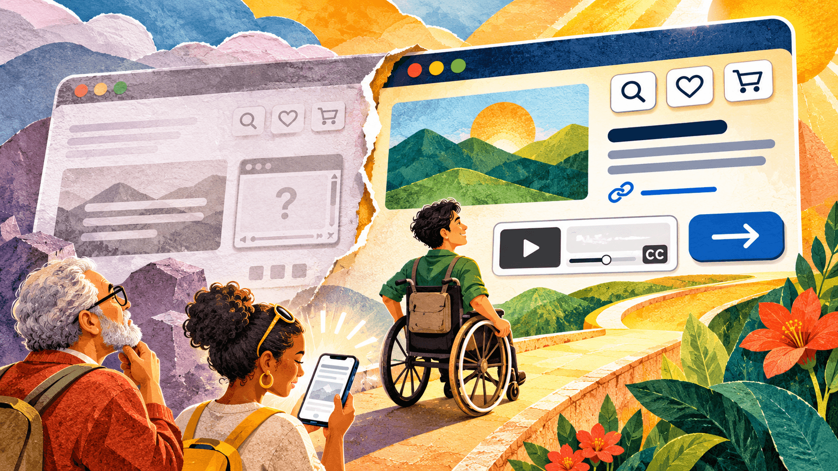
In November 2026 we ran an automated accessibility check on the homepages of 385 small businesses in five US cities: restaurants, cafes, dentists, law firms and hair salons. 335 of them (87%) failed at least one check rated serious or critical. The median site failed two different rules.
The number didn’t surprise us much. What did was where the failures came from. Most of them weren’t deep code problems. They were design decisions, the kind made in a mockup long before a developer touches the page. Here are the habits we saw most, with the share of sites each one showed up on and the fix.
1. Light grey text on white (60% of sites)
Low contrast text was the most common failure by a wide margin: 232 of the 385 homepages had it. It’s usually a style choice. Pale grey body copy looks calm in a design file, and thin text laid over a hero photo looks elegant on a large monitor.
People with low vision, and anyone reading a phone in sunlight, can’t read it. WCAG asks for a contrast ratio of at least 4.5:1 for body text and 3:1 for large text. Check your palette before you hand it over. It’s far cheaper than fixing it after launch. If a brand colour fails on white, keep it for large headings and buttons, and pick a darker shade for text.
2. Icon-only links (45%)
Social icons, a phone icon, a logo that links home. 173 sites had links a screen reader announces as just “link”, with nothing after it. The designer drew a clean row of icons, and nobody wrote down what each one says.
The fix is a short label for every icon in your handoff file: “Instagram”, “Call us”, “Home”. The developer puts it in the code as text or an aria-label. It costs nothing visually.
3. Text baked into images (15%)
Menus, offers and opening hours exported as images, with no text alternative, on 57 sites. A blind visitor gets nothing, and neither does a search engine.
If the image carries information, set that information as real text on the page, and give the image a description that says what a sighted visitor would learn from it. Decorative images get an empty description so screen readers skip them.
4. Maps and booking widgets dropped in as they come (15%)
An embedded map, booking tool, video or review panel is an iframe, and on 56 sites it had no title. A screen reader user hears “frame” and has to guess. Add a title such as “Map to our salon” when you place the embed. It’s one attribute, and it belongs in the design spec next to the embed’s size.
5. Tap targets that are too small (14%)
Tight icon rows and small text links packed together, on 55 sites. People with limited hand control hit the wrong one. We’d aim for targets of at least 24 by 24 CSS pixels, or leave enough space between small ones. Designing for a thumb first fixes most of this.
6. Zoom switched off (13%)
51 sites stopped visitors from zooming in on phones, usually through one setting in the page’s viewport tag, added years ago to stop a layout from jumping. Someone with low vision who pinches to zoom gets nothing. Remove it, then check your layout still holds at 200%. You’ll usually find it does.
7. Links that only change colour (6%)
Links inside a paragraph that differ from the surrounding text by colour alone, on 25 sites. Colour-blind visitors can’t find them. Underline links in body text. It’s an old convention, and it still works.
What an automated check can’t see
Everything above came from axe-core, the open-source testing engine Google’s Lighthouse uses. It only reports what code can check, and its makers say it finds about 57% of WCAG issues on average. A clean result doesn’t mean a site is accessible. Before you sign off a design, spend fifteen minutes on what a machine can’t judge: press Tab through the page with the mouse away and see if you can always tell where you are, zoom to 200%, read every image description out loud, and fill in the contact form with a mistake to see if the error is written in words, not only in red.
The cheapest fix is in the design file
Every habit on this list is cheaper to fix in a mockup than in a live site. Contrast is a palette decision. Labels are a line in the handoff. Tap target size is a spacing token. If you design websites for small businesses, I’d add these checks to your own review before the client sees the first draft.
The full results, with the twelve most common failures, the share by industry and city, and the method, are in our accessibility study of 385 US small business homepages.
Nakshatra Ranjan Saha is the founder of N&D Co., a web design, branding and SEO agency in Kolkata, India, working with businesses in the US, UK, the Netherlands and the UAE.
